
MoMA
A concept project (mobile application) providing users with an in-person museum experience
The Challenge
Recreate the in-person museum experience
MoMA is the Museum of Modern Art located in New York City. It has an evolving art collection containing almost 200,000 works of modern and contemporary art. The museum was forced to close in March 2020 due to the COVID-19 pandemic.
In a concept project, I collaborated with 2 other UX Designers to create a mobile prototype that provides users with an in-person museum experience.
Team
Dhruv Tucker
Karina Gonzales
Madison Massey (me)
Duration
2 Week Sprint
Tools
Figma
Keynote
Miro
Methods
Heuristic Evaluation
C&C Analysis
User Interviews
Usability Testing
Affinity Mapping
Persona Development
Journey Map
Card Sorting
Sketching
Wireframing
Prototyping
Discovery
What is MoMA doing?
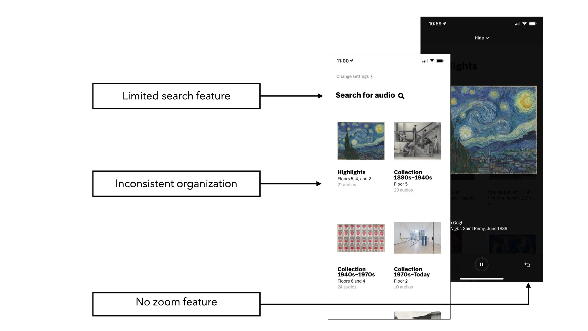
We started by conducting a Heuristic Evaluation of the MoMA Audio app using the L.E.M.E.R.S. method. This gave us an opportunity to explore and discover the features MoMA had been providing.
We were surprised to learn that you could view the details of most of the museum’s art collection but its organization was not intuitive. If you were not physically present within the museum, the search function lacked context. Also, it did not allow you to enlarge the images of the art to better observe specific details, which we felt would be imperative to the immersive experience.
MoMA Audio
What are other museums doing?
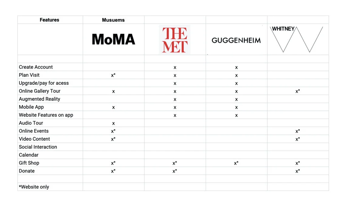
In our competitive, comparative features analysis we studied three of MoMA’s direct competitors: The Met, The Guggenheim, and The Whitney. Each of these direct competitors offer unique features to view art on their websites. However, their mobile experiences lack these same features or, in some cases, they did not have a mobile experience.
Opportunities
The Met offers users a way to view the museum online in a 360 video as a part of their “The Met 360 Project”. A feature that MoMA does not offer.
All direct competitors have a donate button located on the landing page of their website. This provides an easy, direct way for supporters to donate.
MoMA is currently offering a wide range of features and events on their website. This provided valuable content for a mobile app.
How are people feeling?
User interviews identified what users want and expect from their in-person museum experience. By talking to museum goers, we discovered what elements of the physical museum should be showcased within the app.
Our interviewees were tech-savvy Millennial and Gen Z museum-goers. Interviews were conducted remotely through video calls and in person.
Defining our objectives
What features do museum-goers want?
What do museum-goers expect and need from a mobile app?
How are museum-goers staying connected with museum art and events?
After synthesizing interview data, several key trends began to emerge
Users find inspiration through art
Users prefer viewing art in person because they get to experience the textures and size of the work
Users miss going to museum hosted events
Define
Who is the user?
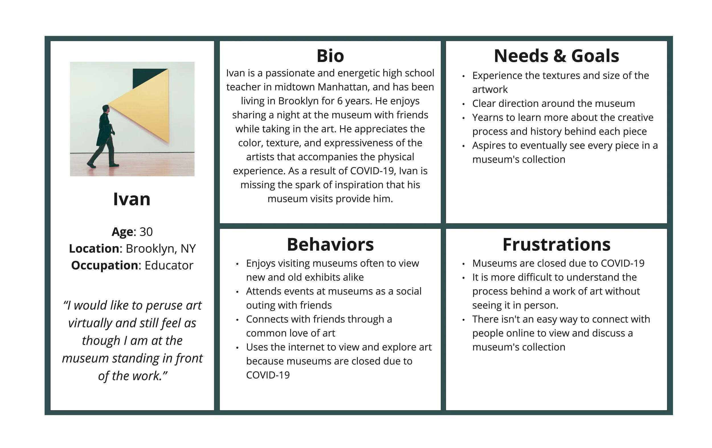
Meet Ivan, our persona. The persona is a summary of the goals, needs, and frustrations of the user. This practice helped ground the product in research by keeping the primary user in mind.
We created a journey map to examine how Ivan searches and views art online, with the goal of identifying pain points that our app could address.

The Problem
Ivan needs a way to view art that emulates the experience of visiting a museum because he is missing the spark of inspiration that art gave him before COVID-19.
How Might We…
…give Ivan an inspiring way to view art?
Design
Kicking off with a design studio to explore multiple solutions
As a team, we started the design phase in a design studio. Each of us sketched independently, simultaneously attempting to solve the same problem.
Then we presented our ideas to one another, taking time to critique each idea. This is where our ideas and solutions came together.
The design studio taught us that problems often have multiple solutions. This team-oriented approach allowed us to create a more dynamic product.
Synthesizing a plan
The feature prioritization method allowed our team to streamline our design efforts. Each feature and function was evaluated based on what was vital to the user experience and/or easy to design versus what was less important to the user and/or took longer to build out. This prioritization kept us focused and was key to meeting the tight timeline of the project.

Lo-fi Prototype
Before getting into the visual design of the MoMA app, the lo-fi prototype was tested to validate design decisions and identify opportunities of improvement. Our goal was to test the navigation scheme and overall usability.
Defining our objectives
The user can quickly navigate to the art galleries page
User will be able to easily navigate the app by using the bottom navigation bar
User will be able to navigate back to the main page
Testing the lo-fi prototype revealed that users were interested in viewing the gallery, but when tasked with navigating to the gallery page felt hesitant on which icon to use. The users that made it to the virtual tour felt like they were just “thrown into it” and expressed how they wanted more direction. We were missing the mark in providing an easy to use experience.
Based on the patterns of feedback, we had clear insights into how we could iterate on the experience to better achieve our goals.
Hi-fi prototype
How we incorporated usability test insights

Bottom Navigation Bar
Adding copy underneath each icon supports the user and allows them to navigate throughout the app effortlessly

Events Page Reformat
Streamlining the layout of the events page to be a list with titles and descriptions proved to be a quicker way to browse events

Virtual Tour Tutorial
The addition of an overlay tutorial, on how to navigate the mixed reality tour, provided the user with confidence when using the app
Next Steps
Social
Users mentioned how they missed visiting museums with friends. First, we want to add a live feature that shows the user how many people are viewing a specific gallery, or work of art, at any given time. Later, users would be able to customize a public profile where they can share their favorite works of art and connect with other users.
Income
The application is currently user-centered. Even though we included a ‘Donate’ option, we would like to research new ways for the museum to continue making money.
More Fun
Features for gamification in which you can take quizzes on art history or general art knowledge. Other possibilities include scavenger or treasure hunts, where you would search the galleries for a particular work, or a detail within a work of art. This would entice users to return frequently to compete against others and complete new challenges.
Usability Testing
Frequent usability testing will continue to identify opportunities to improve the usefulness and enjoyability of the product.
Final Thoughts
More focus on the business
As a team we have created a user-centered mobile application that honors the MoMA brand and allows museum goers to experience art exhibits in an immersive and delightful way.
Reflecting on the project, we may have overlooked an opportunity to help MoMA recover some of their financial losses due to the COVID-19 closure. If given the chance, I would research ways in which the mobile application might generate new funding models and opportunities for MoMA.