Simple Syrup Wine & Spirits
Website redesign providing users with a clear and efficient way to shop for wine online
About
Simple Syrup is a small wine and spirits shop located in Crown Heights, Brooklyn. They are on a mission to provide natural wine that is made with care, love, and respect. When visiting the wine shop in person, the community feels confident and satisfied with their purchases but Simple Syrup’s website does not provide the same customer service. For this reason, I wanted to redesign their website with a focus on the information architecture and the overall appearance to provide a more efficient way to buy wine online for local delivery or pickup.
Team
Madison Massey (me): UX Designer
Duration
2 Week Sprint
Tools
Sketch
Miro
Keynote
Methods
Heuristic Evaluation
C&C Analysis
User Interviews
Usability Testing
Affinity Mapping
Persona Development
Journey Map
Card Sorting
Sketching
Wireframing
Prototyping
Project Goals
Organize product categories to create an intuitive experience for the user when shopping for a specific product
Redesign the website’s appearance to support the user in a delightful experience while enhancing the store branding
Discovery
Process of identifying user’s problems and empathizing on vital issues
Through research I sought to understand Simple Syrup as a brand, the products they offer, and their current user’s experience. I started by doing a Heuristic Evaluation, Competitive & Comparative Analysis, and User Test Interviews.
I found users to interview by word of mouth. I tapped into my neighborhood community by talking with neighbors and friends to interview users who had a baseline knowledge of wine.
I developed an interview plan and guide to help answer significant questions, such as:
How do users discover new wine?
How do users shop for wine?
What are user’s preferences surrounding wine?
What do users like/dislike the most about visiting Simple Syrup?
How often do they visit Simple Syrup?
What are the biggest concerns that they face when doing so?
Users raved about Simple Syrup’s thoughtful in-store offering and excellent recommendations but felt frustrated while searching on the website due to a lack of brand messaging and organization.
User Insights
Users like information to be clear and organized so they can find things quickly
Users want the in-store experience online
Users value having an expert opinion because researching is time consuming
Define
Synthesizing user research findings
Based on these key insights from user interviews and usability test, I created a Persona and a Journey Map to better empathize with the user and prioritize goals according to their needs. The preferences, needs, goals and frustrations of the persona reflects the interviewees lifestyle; as it should be relatable to the end user.
Problem Statement
Users need a way to quickly and confidently pick out a bottle of wine so they can spend time with family and friends.
How might we…
give users the in-store experience online so they can easily support their local wine shop?
Design
I used the Problem Statement and HMW question as a guide in the ideation phase to come up with possible solutions that will address the needs of the user. Because my main goal during this process was to reorganize product categories, I started my redesign with the navigation scheme.
During an open card sort I asked 7 participants to organize products from Simple Syrup’s wine shop into logical categories in order to identify how users expected information to be organized.
Card Sort Key Insights
86% of participants agreed that ‘ready-to-drink’ and ‘liqueur’ should be grouped together with liquor.
The majority of participants grouped all of the wine into sub categories (red, white, rose, bubbly)
The results for Sake were scattered across the board - based on this data I decided to separate it into a category of its own
Navigation Scheme
Before
Users are unable to shop wine by variety leaving them scrolling through pages of products to find the type of wine they prefer. (SS Store Current Website)
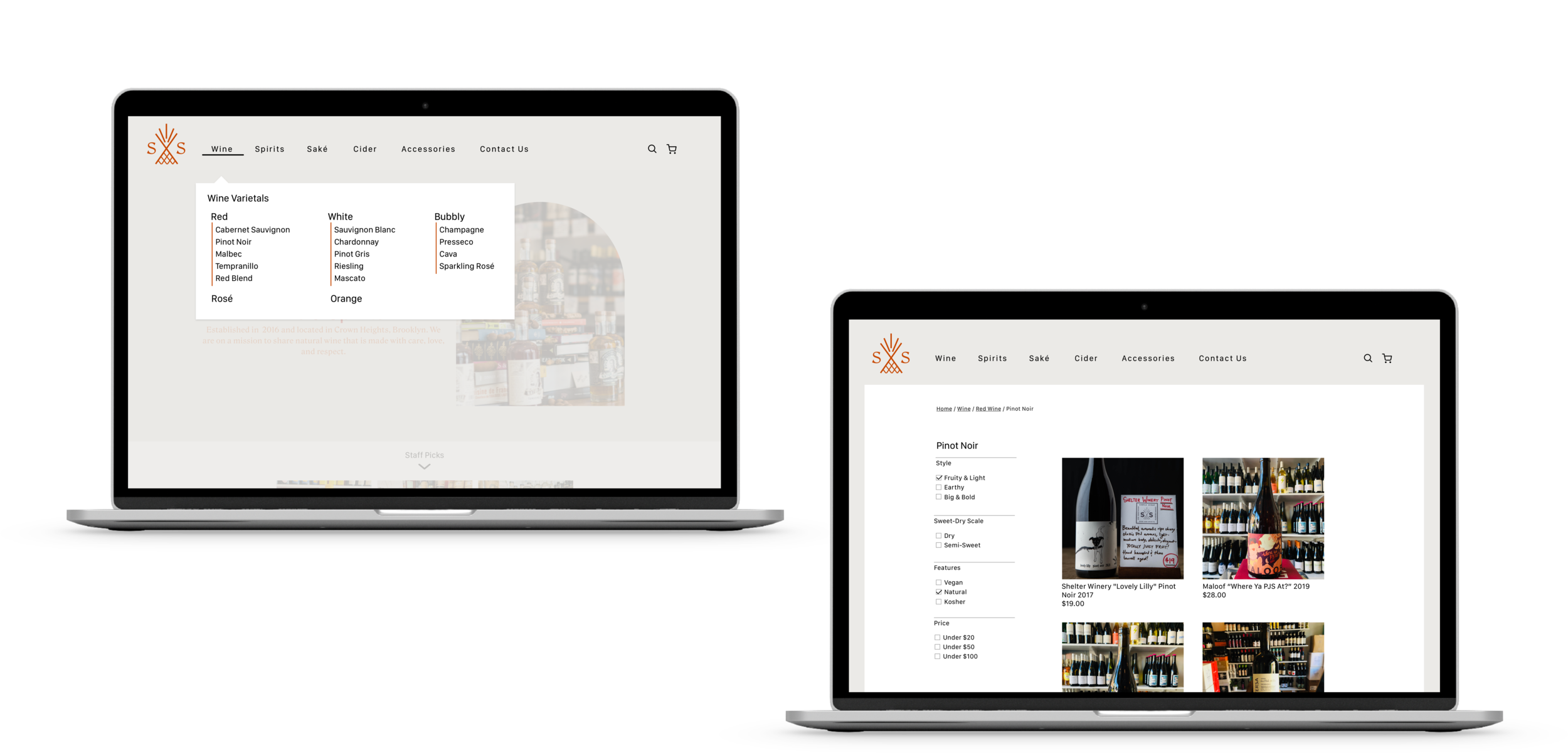
After
I added a mega navigation feature to provide the user who knows what they want with a quick and easy way to filter and shop by variety of wine.
Iterate, iterate, iterate
Usability Testing
Conducting usability test during all stages of prototyping was key to designing a user centered product. Interacting with the user provided insights that guided me through all iterations.
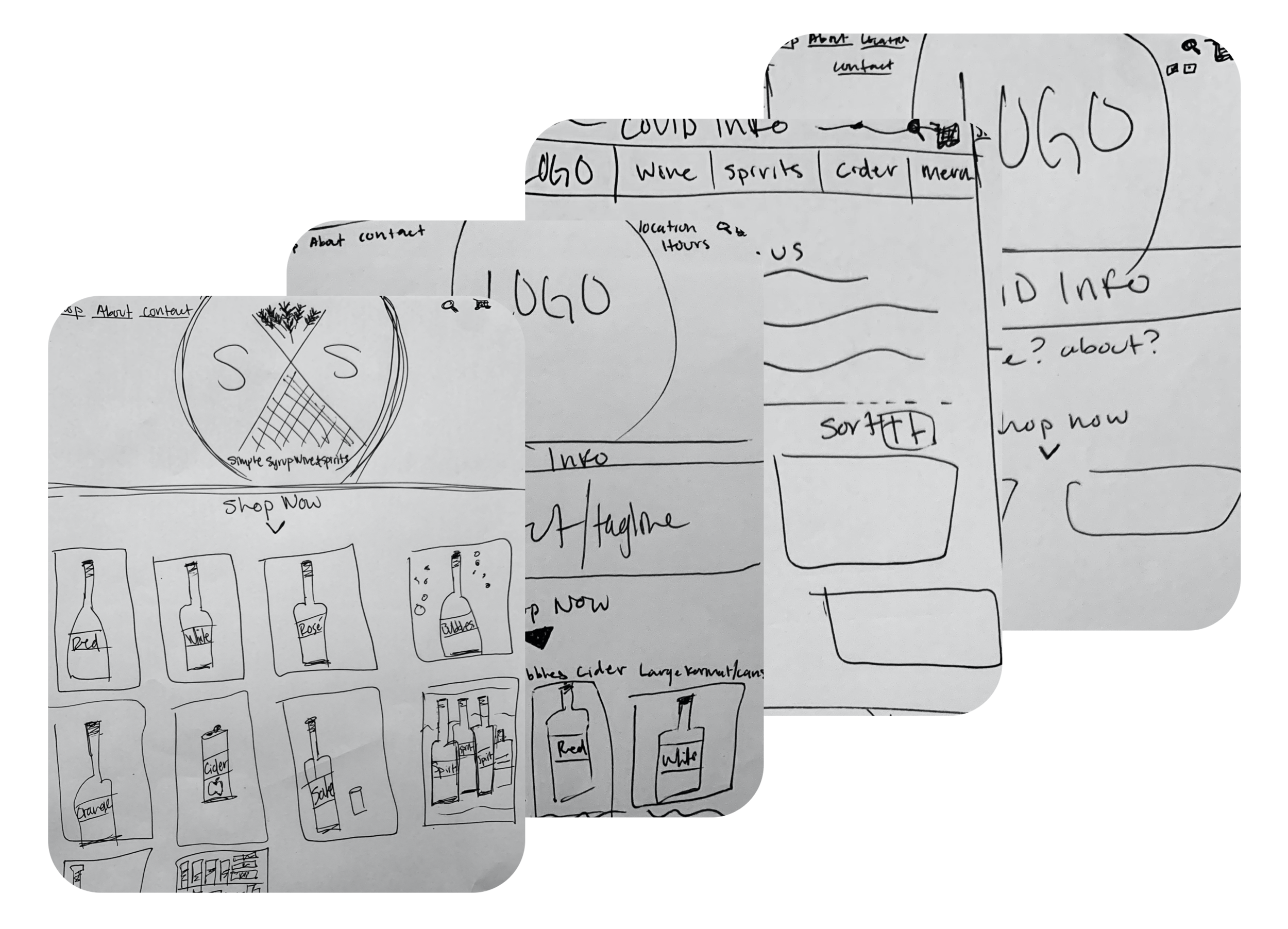
With low-fidelity paper prototypes, the general structure of the website could easily be tested with users. I was able to make adjustments without much effort before going into the much more costly digital implementation.
Prototype
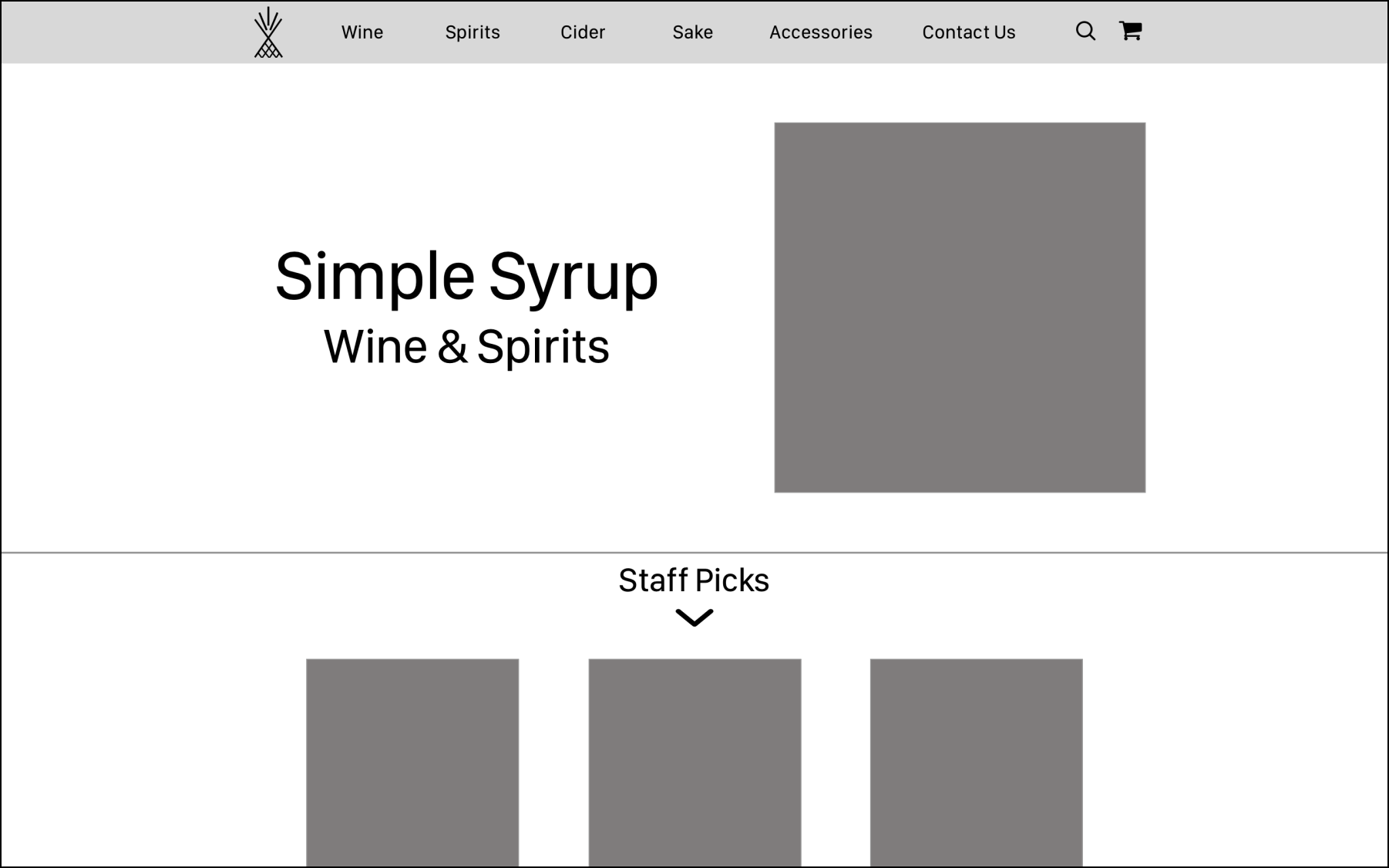
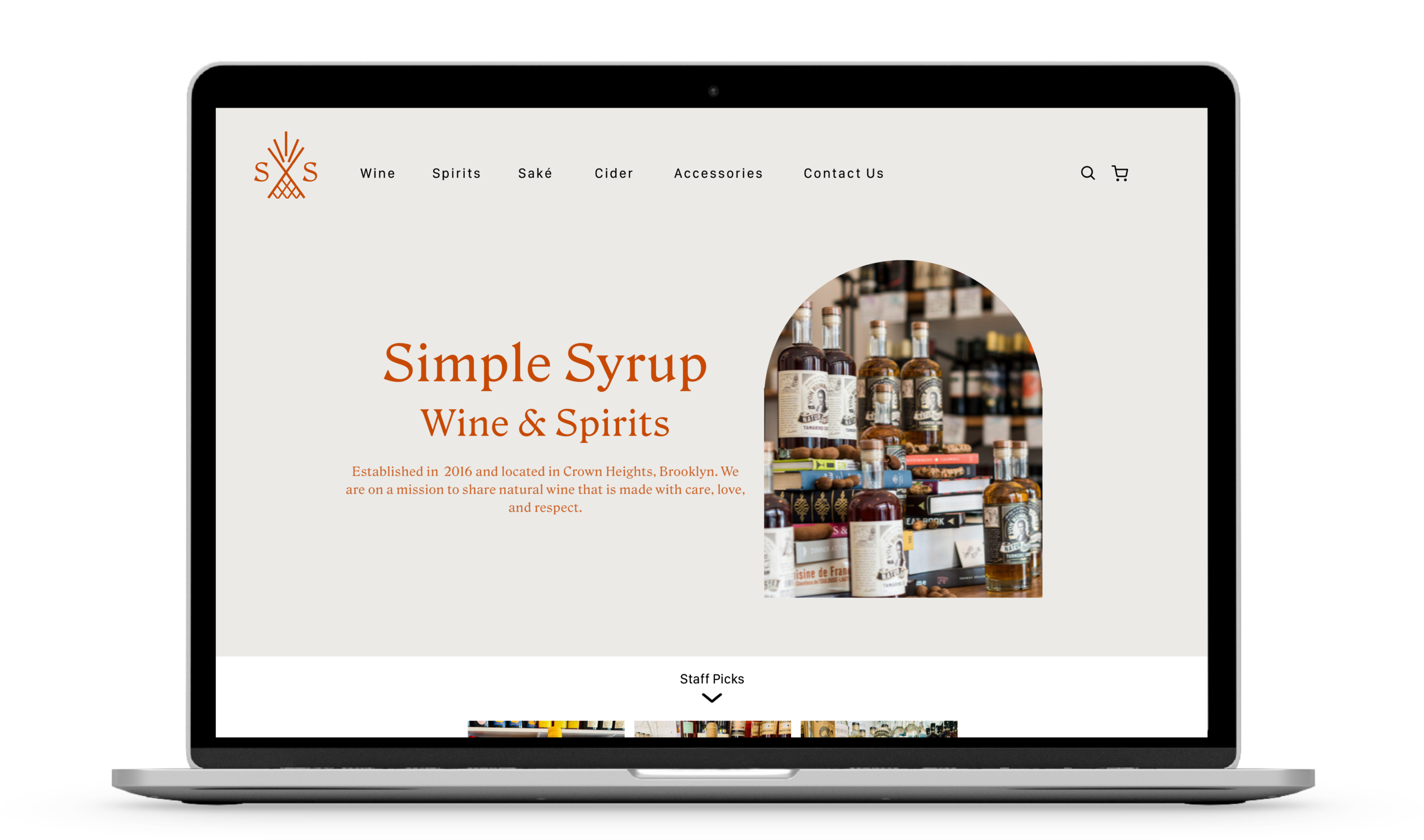
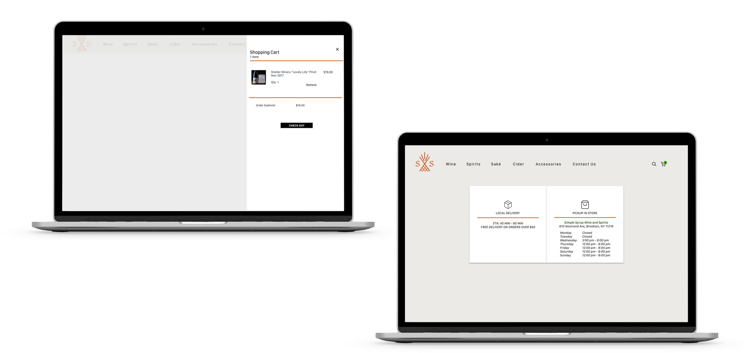
The mid-fidelity and hi-fidelity clickable prototypes were created using Sketch. Again, user tests revealed small vulnerabilities in the general navigation, layout and font sizes.
Next Steps
Adapt the experience appropriately across desktop and mobile
Design a space for Simple Syrup to share upcoming wine tastings and events on their website
Continue user testing to identify any opportunities for updates

